Talking-Head Video Positioning: Where to Sit for Every Aspect Ratio
Good talking-head framing looks effortless because every important element has somewhere to go.
The speaker’s eyes sit in a comfortable part of the frame. Captions do not cover the mouth. Gestures remain visible. Graphics have room to appear. Platform controls do not hide the point.
Bad framing usually comes from treating every aspect ratio as the same canvas with different edges cut off.
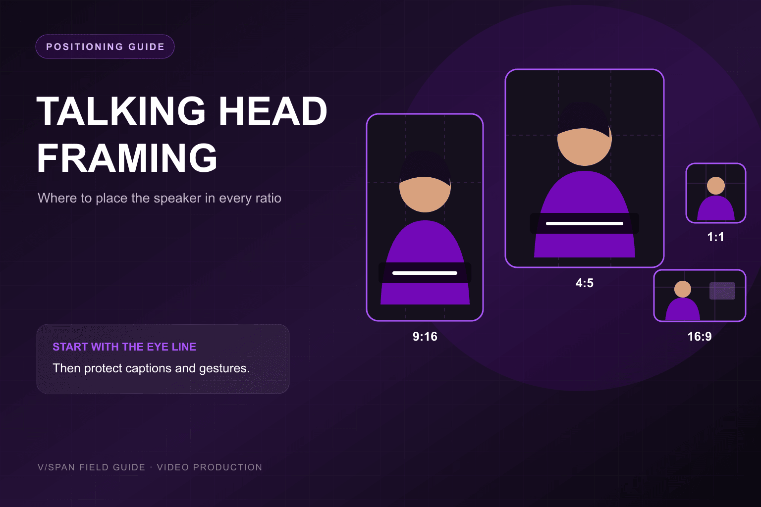
This guide gives you practical starting positions for 9:16, 4:5, 1:1, and 16:9, then shows how to capture one master that can become each format without turning the speaker into an afterthought.
Start with three anchors
Before choosing a ratio, establish three things:
- Eye line: In a straightforward direct-address shot, start with the eyes near the upper third—often around 35–40% from the top of the final frame.
- Speaker axis: Center the speaker for direct address. Move toward the left or right third when another visual needs a persistent place beside them.
- Caption zone: Reserve space below the speaker’s face for captions, then separately account for platform interface elements.
These are composition guides, not universal pixel specifications. Lens choice, shot size, gesture, set design, and the current platform UI can all justify a different choice.
Framing and safe-zone preview
Position the speaker for the canvas
9:16 · Direct address
Keep the eyes near the upper third and the chin clear of mid-frame captions. Reserve the bottom quarter for platform controls; use side-by-side graphics sparingly.
- Starting eye line
- ~36% from top
- Lower caution zone
- ~24%
Quick positioning guide
| Ratio | Starting speaker position | Starting eye line | Best use | Watch out for |
|---|---|---|---|---|
| 9:16 | Centered; slight offset only when necessary | ~36% from top | Reels, Stories, Shorts, vertical explainers | Bottom controls, narrow graphics, clipped gestures |
| 4:5 | Centered or on a third with a compact graphic | ~36% from top | Mobile feed, LinkedIn, Instagram feed | Titles pushing the face too low |
| 1:1 | Centered; left third for a right-side visual | ~38% from top | Square feed and mixed-format campaigns | Too much unused space above and below |
| 16:9 | Centered for direct address; on a third for demos | ~38% from top | YouTube, websites, presentations, interviews | A tiny speaker surrounded by irrelevant background |
Use the percentages as a first setup. Then judge the actual export with captions and graphics enabled.
9:16: protect the face and the lower interface zone
For full-vertical video, the speaker should usually be centered horizontally. There is rarely enough width for a comfortable speaker-plus-slide layout, and a strong offset can make the face feel squeezed against the edge.
Start with:
- Eyes around 35–38% from the top
- A medium close-up or close-up, depending on how much gesture matters
- Captions around the lower-middle of the image, above the interface controls
- Essential text and logos inside a center-safe column
- Extra room around the hands if gestures are part of the delivery
Where captions should go
“Put captions at the bottom” is incomplete advice. The bottom of a vertical social video can contain usernames, descriptions, audio labels, progress indicators, and action controls.
Place captions low enough to feel natural but high enough to remain readable above those elements. Keep line lengths short and avoid covering the mouth. Because interfaces vary and change, check the actual destination rather than relying on one permanent safe-zone template.
Where graphics should go
For a vertical frame, prefer:
- A graphic above the speaker’s shoulder
- A brief full-screen cutaway
- A small label near the upper third
- A caption-sized keyword rather than a dense slide
If a chart needs a full explanation, cut to it. Do not reduce it until it fits beside an ear.
4:5: balance feed presence with breathing room
The 4:5 canvas gives you more lateral flexibility than 9:16 while retaining strong mobile-feed presence.
For direct address, center the speaker with the eyes around the upper third. If you need a persistent graphic, move the speaker slightly toward the opposite third and reduce the graphic to one clear idea.
This ratio works well for:
- Expert commentary
- Leadership updates
- Customer stories
- Product explanations with one supporting visual
- Branded templates with a concise title above the face
The most common mistake is stacking a title, speaker, subtitles, and logo into four rigid horizontal bands. The result has no visual hierarchy. Let the title appear when needed, then give the frame back to the speaker.
1:1: use symmetry intentionally
Square framing naturally supports a centered composition. It can feel balanced and direct, but it also creates unused space when the original shot was designed for widescreen.
Start with the eyes around 38% from the top and choose a shot size that makes the face easy to read on a phone.
For a speaker-plus-graphic composition:
- Put the speaker on the left third
- Place one compact visual on the right
- Keep both elements within the same visual weight
- Avoid wide screenshots with small interface text
Square video rewards simplicity. A head-and-shoulders shot plus one keyword or diagram is usually stronger than a miniature webinar layout.
16:9: choose direct address or look room
Widescreen gives you the most compositional choice.
Center the speaker when:
- They speak directly to the viewer
- The background adds useful context
- No persistent graphic needs the side space
- Symmetry supports the tone
Place the speaker on a third when:
- A product demo or slide occupies the other side
- Another person joins the conversation
- You want deliberate visual tension
- The speaker should look into open space rather than into the frame edge
For an interview-style off-camera look, the open space in front of the speaker’s gaze is called look room or lead room. A speaker on the left third generally looks toward frame right; a speaker on the right third generally looks toward frame left.
For direct-to-camera delivery, center framing often feels more natural even when a graphic occasionally appears. You can bring the graphic in as a cutaway instead of leaving the speaker off-center for the entire video.
How to capture one master for multiple ratios
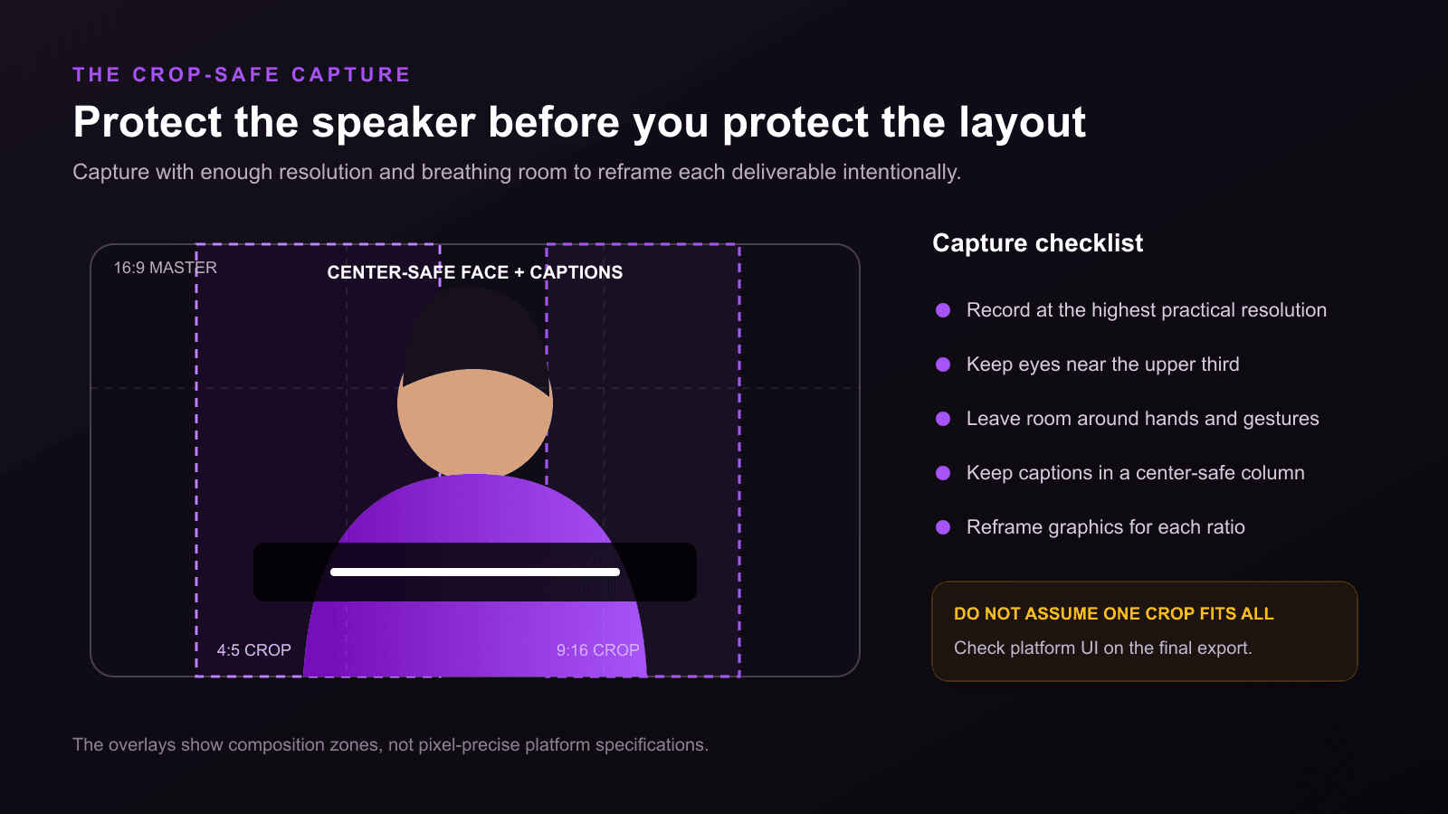
A multi-format deliverable starts before recording. Otherwise, “repurposing” becomes emergency cropping.
1. Record enough resolution
If a vertical deliverable will be cropped from a horizontal master, the crop uses only part of the original width. A 4K master gives you more room to reframe than a 1080p master, but it does not make every crop good.
Record at the highest practical resolution your workflow supports, and inspect the vertical export at its final display size.
2. Protect the center-safe action
Keep the face, essential gestures, and critical props where the narrowest planned crop can retain them.
This does not mean trapping every speaker in the exact center. It means knowing which compositions can survive repurposing and which require a separate setup.
3. Give the shot extra breathing room
A very tight horizontal close-up may leave no room to adjust eye line or caption placement in a vertical crop. A slightly wider master can preserve options.
Do not go so wide that the vertical version becomes a tiny face. Test a crop during setup, not after the speaker leaves.
4. Design graphics as separate layers
Keep titles, captions, lower thirds, and supporting visuals out of the camera master when possible. Rebuild their placement for each ratio instead of scaling the entire widescreen composition down.
A 16:9 lower third stretched across a 9:16 crop is not a responsive design system.
5. Check gaze and gesture continuity
When punch-ins or alternate crops change the speaker’s position, keep the eye line and screen direction coherent. A cut that makes the speaker jump from one edge to another without a narrative reason can feel disorienting.
Choose the shot size for the message
Aspect ratio is only one part of positioning.
- Close-up: Useful for emphasis, emotional delivery, and small mobile screens. Leaves little room for gestures or props.
- Medium close-up: A versatile default for expert commentary and direct address.
- Medium shot: Useful when hands, a product, or the immediate environment matter.
- Wide shot: Useful for establishing context or physical demonstration; often weak as the only talking-head shot on mobile.
Do not solve a boring message by moving closer. Choose the shot that lets the viewer read the speaker and the evidence.
The final framing checklist
Before recording or exporting, check:
- Are the eyes near the intended upper-third region?
- Is there enough headroom without a large dead area above the speaker?
- Does the speaker have look room when facing off-camera?
- Can the narrowest planned crop retain the face and essential gestures?
- Do captions avoid the mouth and current platform controls?
- Are supporting graphics readable at phone size?
- Is the speaker large enough for the intended viewing context?
- Are logos and key text inside the actual destination’s safe area?
- Does every crop preserve resolution and intentional composition?
The goal is not to make the speaker fit whatever canvas remains. It is to design the canvas around what the viewer needs to see.
Choose the eye line first. Give the idea room second. Then make every crop look like it was planned—because it was.
Read more

How to Convey Brand Meaning in a 30-Second Video
A practical 30-second video framework for turning one brand idea into a clear signal, credible proof, and memorable expression—without relying on a longer logo animation.
What Is B-Roll? The Complete Guide for Modern Video Creators
Learn what B-roll is, why it matters, and how to use it effectively to elevate your video content across LinkedIn, social channels, and professional productions.
How to Use Jump Cuts to Hold Attention Without Creating Visual Noise
Learn when jump cuts improve pacing, where to place them, when to use punch-ins or B-roll, and why information change matters more than cutting on a fixed timer.